Psychedelic Poster Art
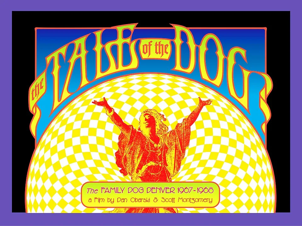
1960s; Wes Wilson’s Fillmore concert posters, 1966
Prompt
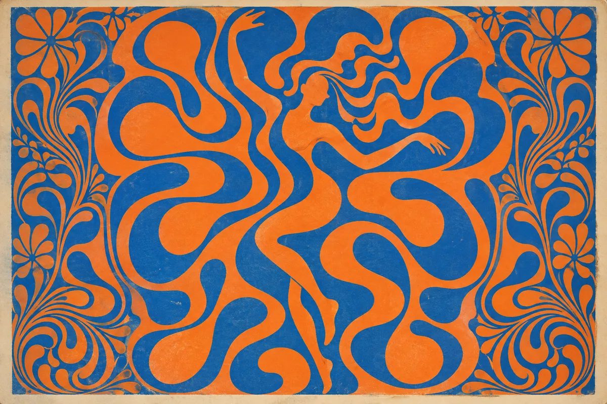
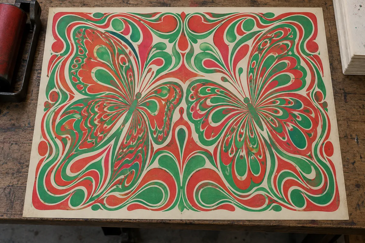
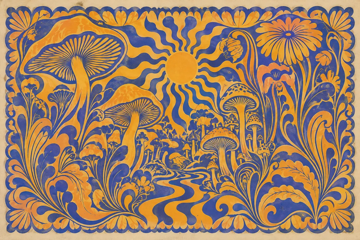
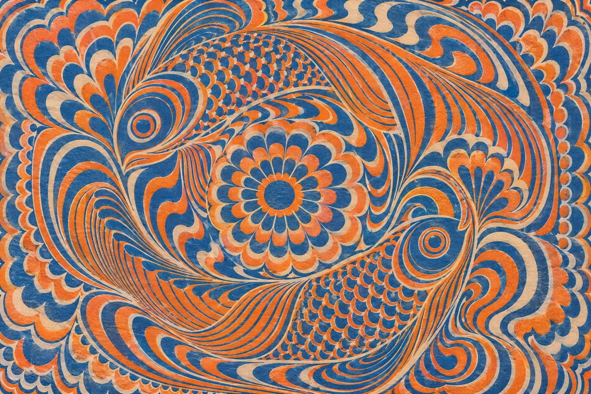
Transform this image into Psychedelic Poster Art, using saturated orange against electric blue, magenta against green, and tightly packed swirling ornament. Bend contours into flowing, lettering-like shapes without readable text, add dense decorative borders, and retain flat printed-ink textures with vibrating color boundaries. Keep the original subject and composition.
Identify
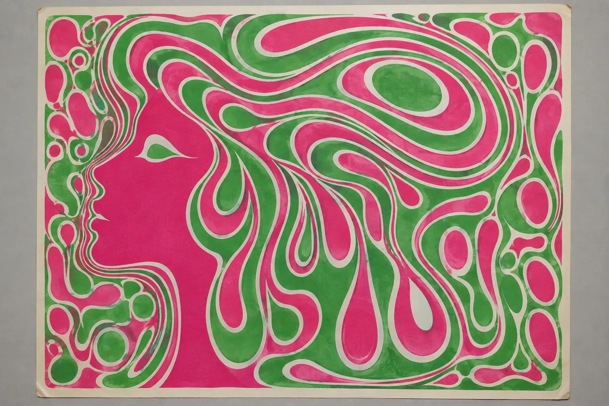
Melting lettering fills tightly packed shapes, often making words look like pictures. Vibrating complementary colours surround swirling ornaments, distorted figures, and dense decorative borders.
Principle
Strong hue contrast with similar lightness can make neighbouring colours seem to shimmer along their edges. This perceptual effect involves simultaneous contrast1; printed inks absorb selected wavelengths rather than emitting coloured light.
Example
Wes Wilson: The Association (BG-18), 1966.
Try it out
Place saturated red and green paper strips together, then separate them with white paper; compare how steady their shared edges appear.
Background
Psychedelic posters became closely associated with San Francisco’s rock concerts and counterculture during the 1960s. Wes Wilson’s 1966 Fillmore posters helped establish their swelling, tightly fitted lettering. Artists drew on Art Nouveau curves, historical lettering, and contemporary experiments with visual perception. Hand-drawn words could become patterns that rewarded slow reading rather than immediate recognition. Offset lithography2 reproduced these designs using subtractive colour3: inks absorbed parts of the light reflected from paper. Closely matched lightness and strong colour differences could make boundaries appear unstable. The apparent movement belonged to perception, not the printed sheet.
Distinction
Op art often builds illusions from repeated geometric patterns, sometimes using only black and white. Psychedelic posters combine perceptual instability with expressive lettering, imagery, and concert information.
Aftermath
The style shows how colour relationships and letter shapes can turn practical information into a demanding visual experience.
Further examples · 7 images

Question
Why can two sharply different colours still make an edge difficult to read?
Show possible answer +Hide answer −
Their hues may differ strongly while their lightness remains similar. That weak lightness boundary can make fine details harder to resolve.