1959, Saul Bass's title sequence for North by Northwest
Typeface · Anton
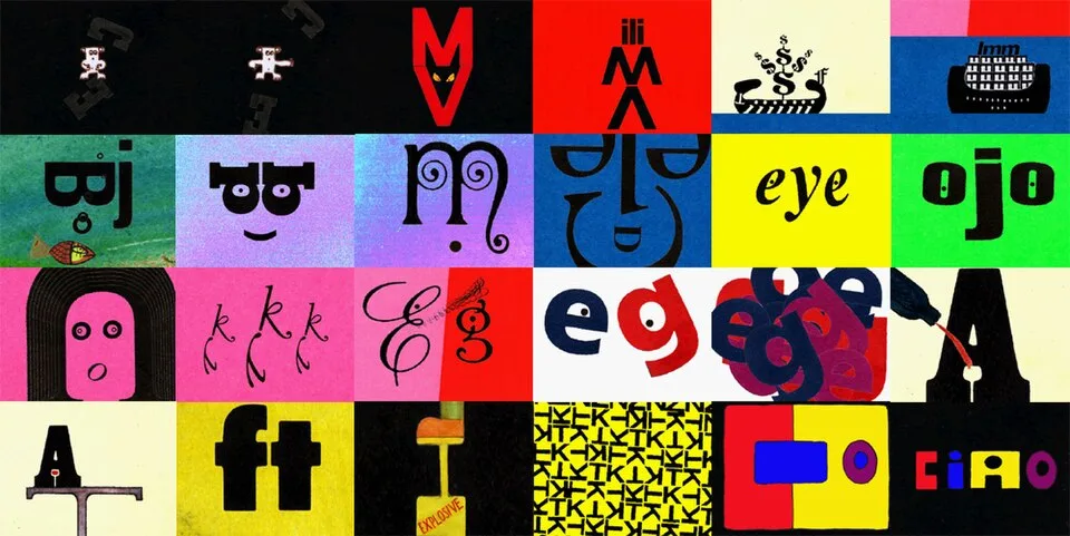
Letters as Animated Characters. A colorful montage presents letters as faces, figures, and playful arrangements with varied orientations and proportions.Simonsegni (Stefano Simonetti) · CC BY-SA 4.0 · via Wikimedia CommonsView source ↗
Prompt
Apply a Kinetic Typography treatment using existing text or small descriptive words as bold cutout letterforms. Suggest movement through stepped position echoes, changing letter scales, angled baselines, and crisp directional trails. Use a restrained midcentury palette and place lettering around essential visual details. Keep the original subject and composition.
You see [written words moving], shrinking, or expanding across the screen. The text acts like acharacter, shifting to match the audio.
Principle
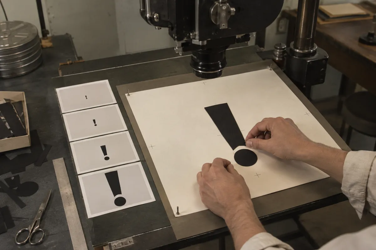
Animators [manipulate individual text elements]frame by frame1on afilm camera stand2. They alter the position, [scale, and rotation]of cut-out letters over time.
Example
Saul Bass: North by Northwest title sequence, 1959.
Try it out
Watch alyric video on mute. Try to guess the mood of the song based purely on how the words move.
Background
Before the 1950s, film title sequences were mostly static cards shown to credit the cast and crew. Designers like Saul Bass changed this by treating text as amoving, expressive element. By moving paper cut-outs under acamera, they made words slide, stretch, and collide in rhythm with the musical score. This transformed opening credits from aboring necessity into an active part of the storytelling. Kinetic typography set the mood of the film before any actors appeared. The technique soon spread to television commercials and eventually digital animation.
Distinction
Kinetic typography involves moving text to express emotion or rhythm. This differs from standard subtitles, which stay still at the bottom of the screen just to translate dialogue.
Aftermath
It teaches us that how aword moves can be just as important as what the word actually means.
Further examples · 7 images
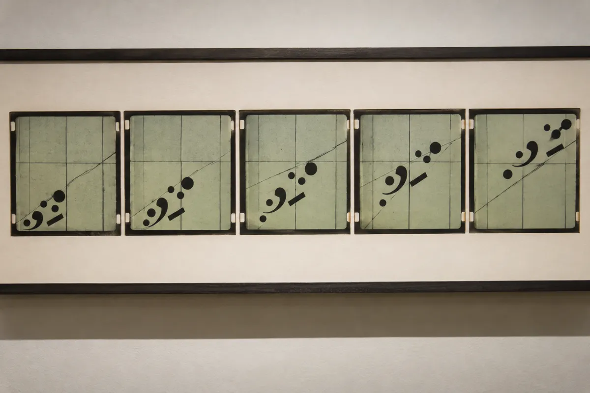
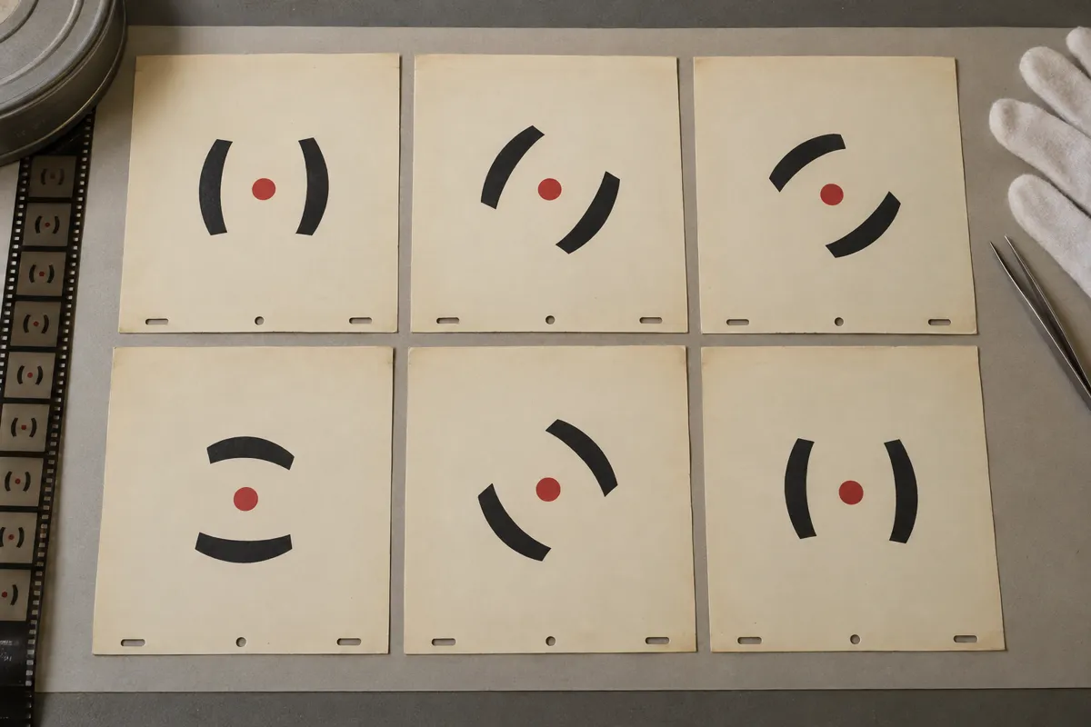
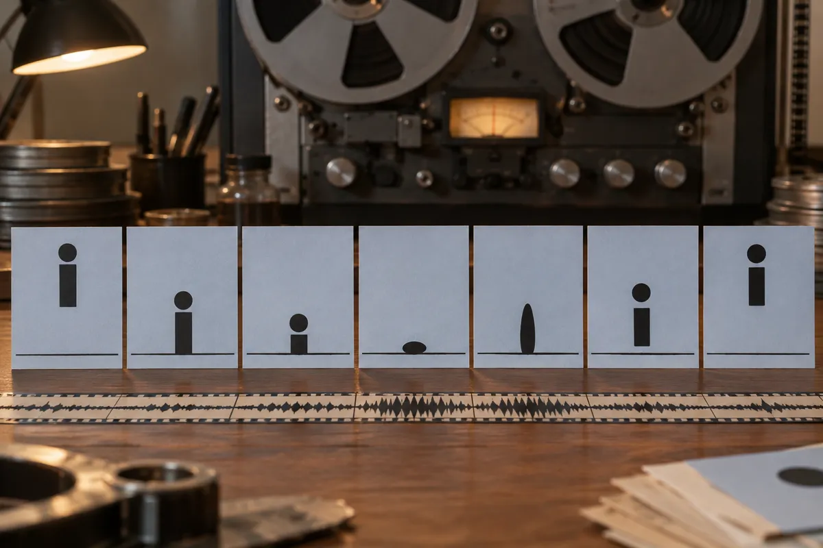
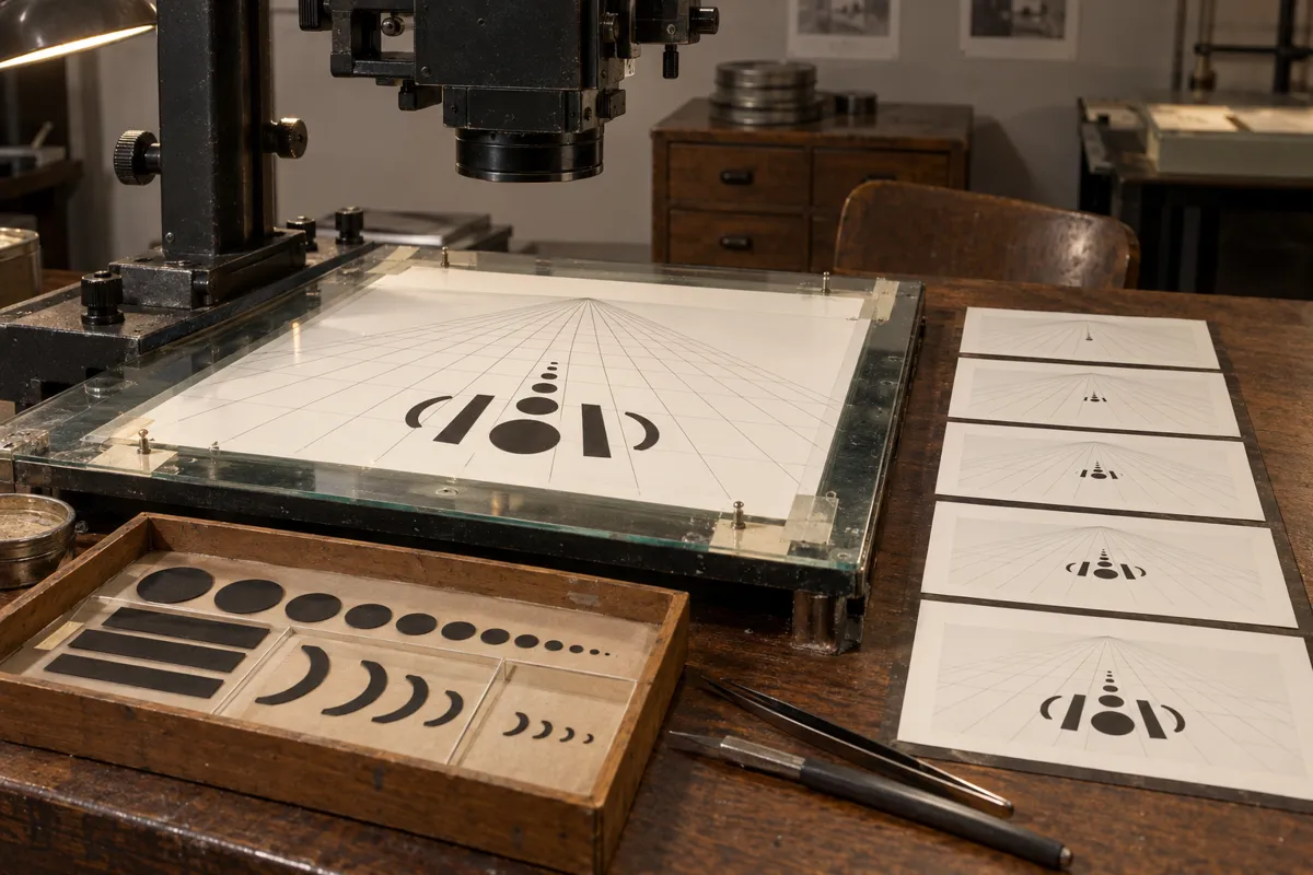
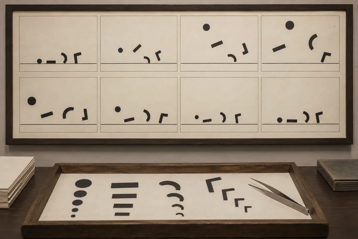
02AI illustration: Sequential film frames of animated abstract typographyA series of sequential film frames shows abstract character elements ascending along a diagonal axis. These panels illustrate the frame-by-frame transformation of type elements used to synchronize visual motion with a musical score.Illustration generated for the Atlas (AI)03AI illustration: Manual manipulation of typographic elements for animationAn animator's hands are shown positioning a large cut-out exclamation point on a rostrum camera stand. This demonstrates the manual manipulation of individual glyphs to create the illusion of growing or moving text in cinema.Illustration generated for the Atlas (AI)04AI illustration: Rotational animation cels for typographic charactersA set of animation cels depicts the rotational movement of punctuation marks around a central point. The sequence captures how static characters are staged to perform expressive, character-like movements through time.Illustration generated for the Atlas (AI)05AI illustration: Kinetic squash and stretch of typographic charactersA row of illustrated cards shows a lowercase letter 'i' bouncing and squashing against a baseline, paired with a visible optical soundtrack. The progression highlights the technique of treating text as a physical character that reacts to audio cues.Illustration generated for the Atlas (AI)06AI illustration: Animation stand with perspective-based kinetic typographyA workspace features a rostrum camera focusing on a perspective grid where typographic components are arranged to simulate depth. The tray of varied letter parts illustrates the modular approach to creating complex moving text sequences.Illustration generated for the Atlas (AI)07AI illustration: Storyboard and cut-out assets for moving textA storyboard displays a sequence of abstract shapes and letter fragments scattered and reassembling across frames. Below, a tray of cut-out components shows the physical assets used to construct these animated typographic movements.Illustration generated for the Atlas (AI)
Question
Why did early kinetic typography require intense manual labor?
Show possible answer +Hide answer −
Before computers, animators had to physically move paper letters tiny amounts for every single frame of film. Afew seconds of moving text required hundreds of precise adjustments.