Grunge Typography
1990s; David Carson’s art direction for Ray Gun, launched in 1992
Prompt
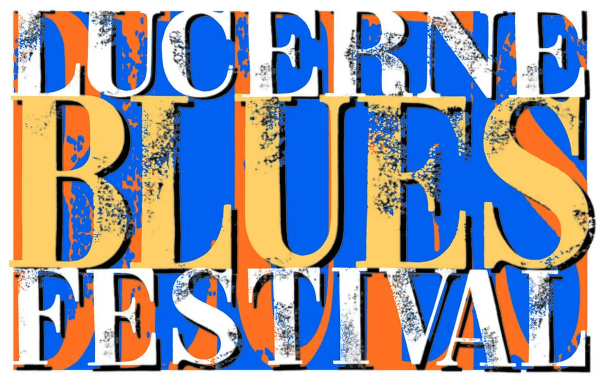
Apply a grunge typography effect using distressed letter fragments, broken ink edges, uneven spacing, mixed character sizes, and overlapping text layers in peripheral areas. Add photocopier grain, paper stains, scratches, faded black ink, and occasional muted red accents without hiding defining features. Keep the original subject and composition.
Identify
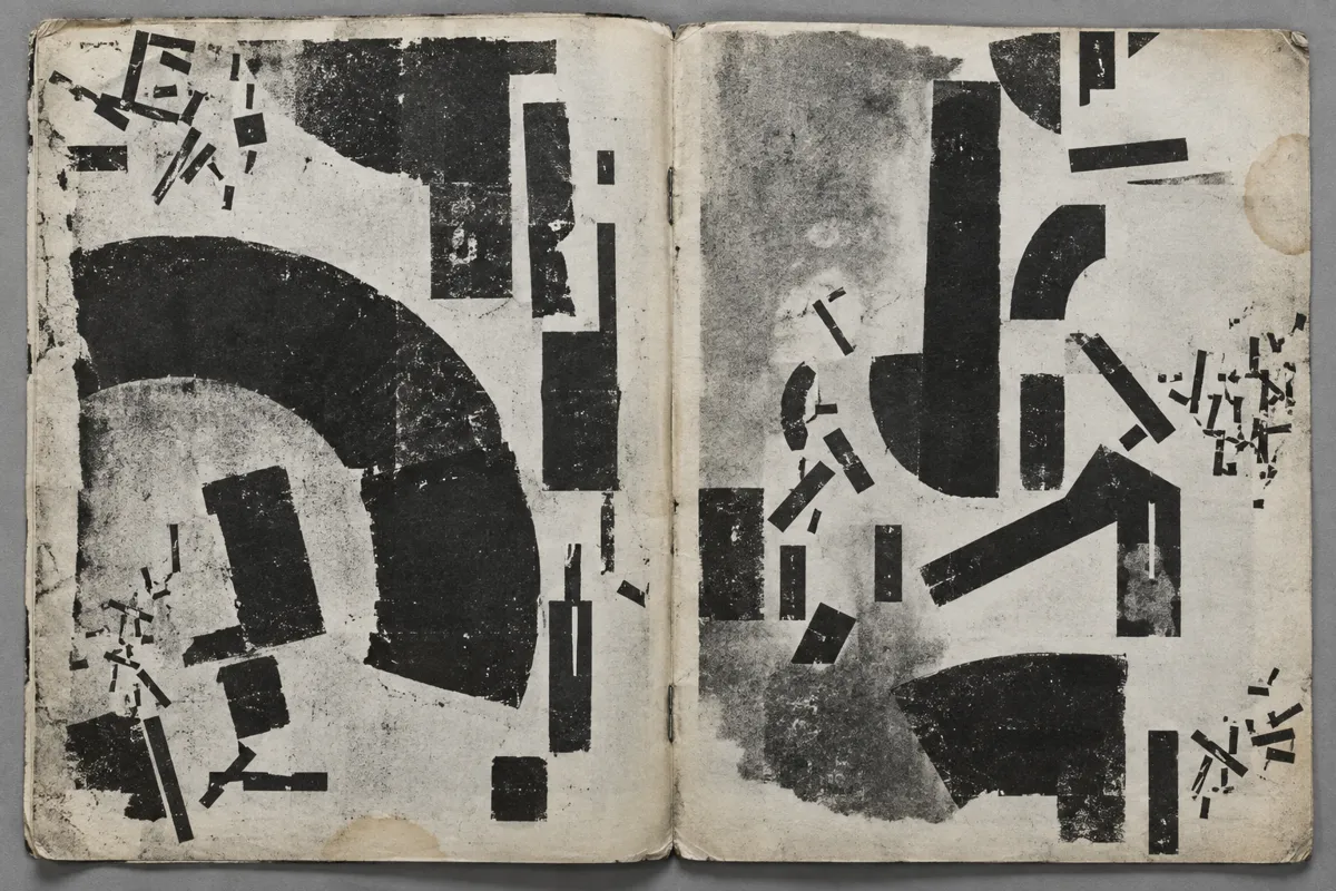
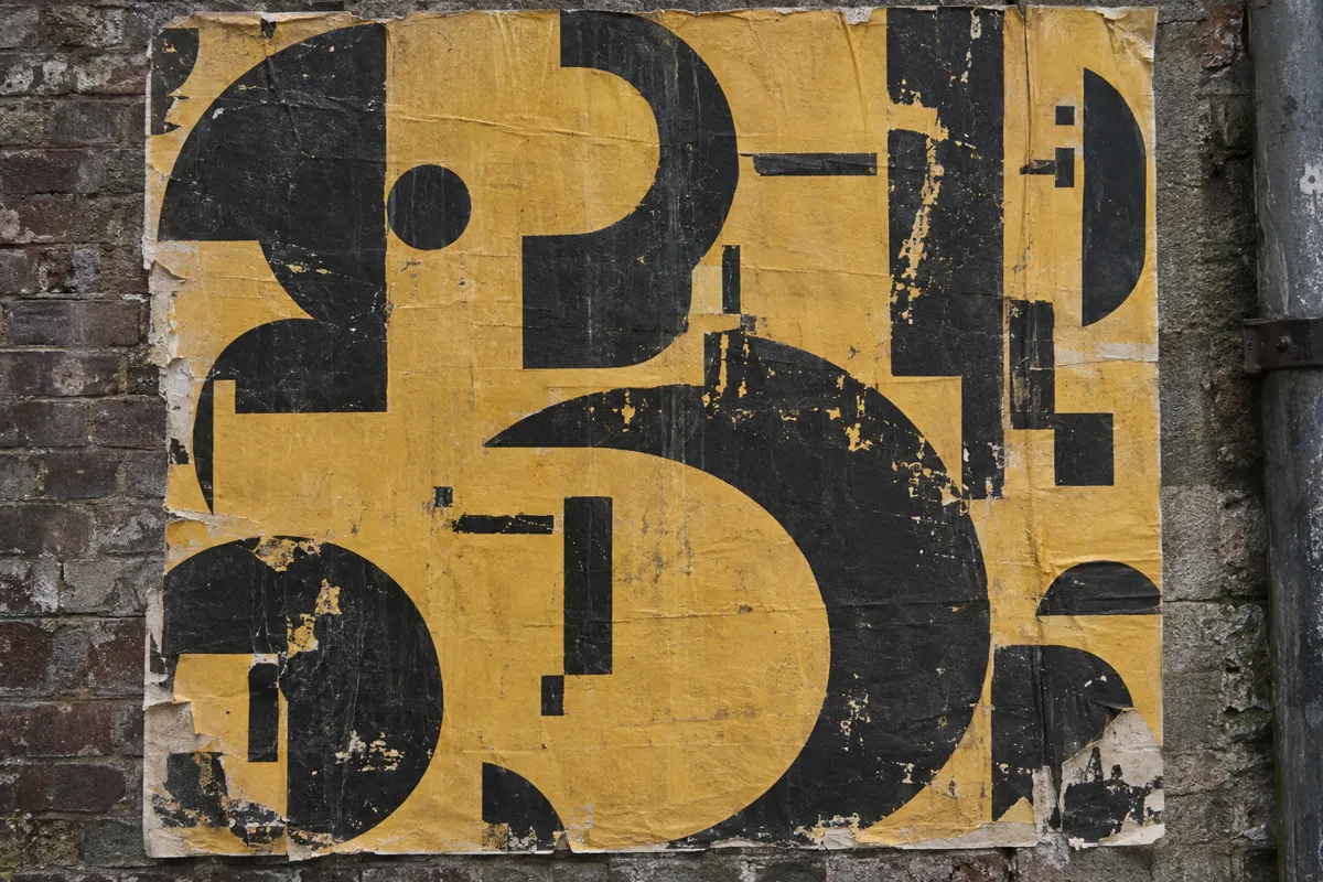
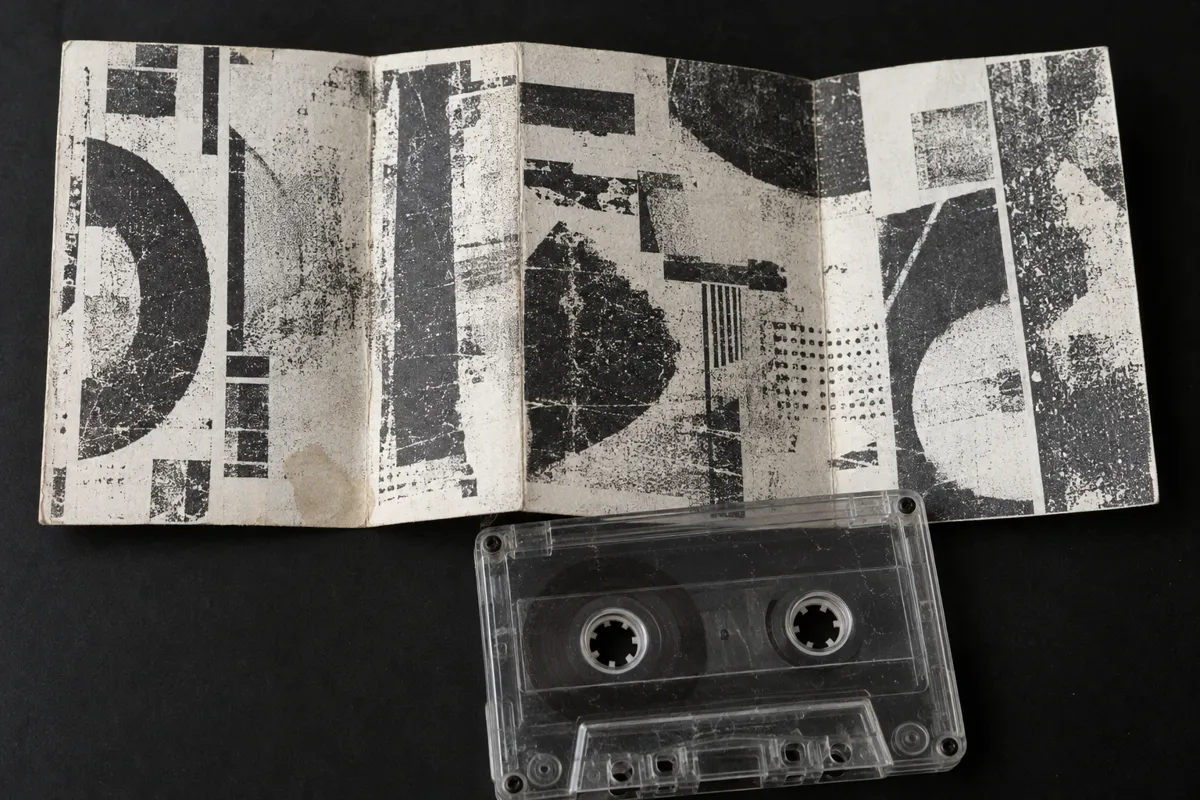
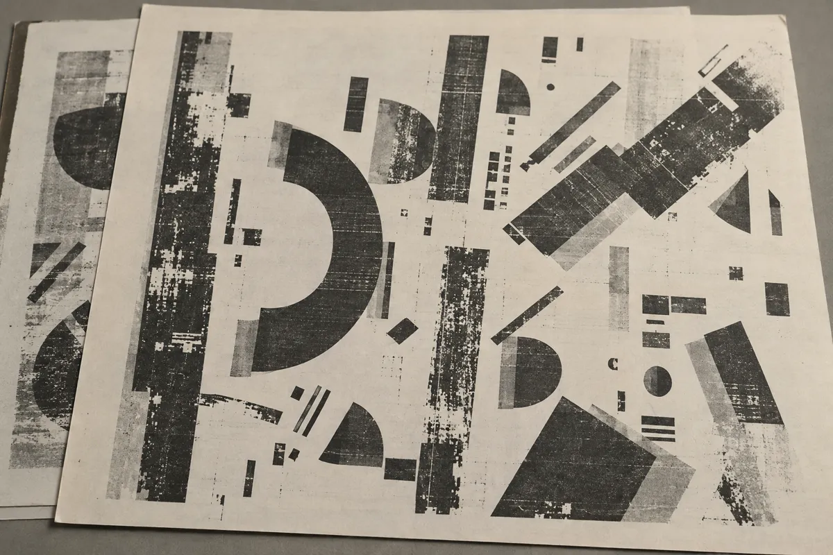
Letters show broken edges, uneven spacing, and overlapping layers. Scratches, stains, mixed sizes, and abrupt changes of direction make text look worn or unstable.
Principle
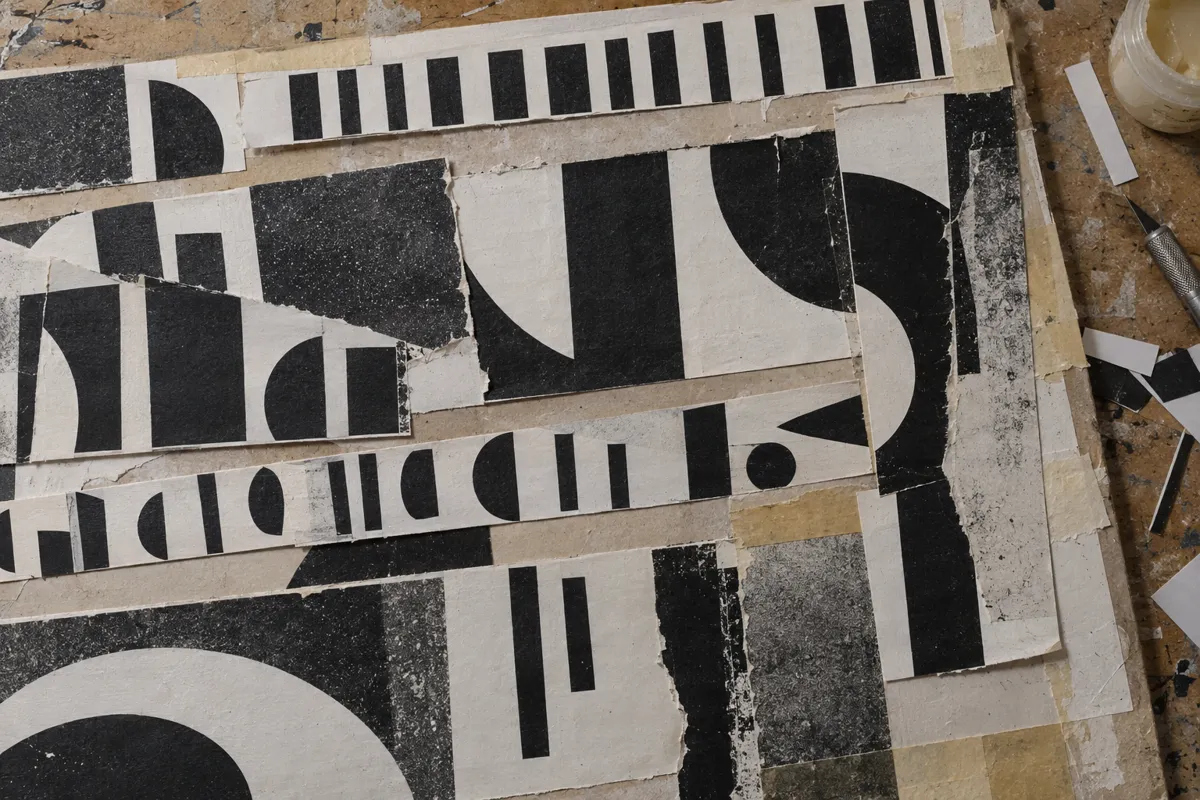
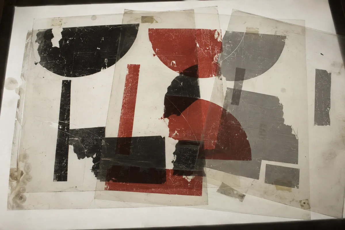
Photocopy degradation1, physical abrasion, or digital masks2 interrupt letter shapes. Layering and irregular placement disrupt the reading order without necessarily damaging the type itself.
Example
David Carson: Ray Gun magazine art direction, 1992.
Try it out
Photocopy a printed headline several times, using each copy as the next original; compare its edges with the first print.
Background
Grunge typography became prominent in 1990s music magazines, record packaging, and alternative publishing. It drew on punk graphics, photocopied zines, collage, and earlier experiments with fragmented text. David Carson’s work for Ray Gun helped make disrupted reading order widely recognizable. Designers combined damaged source material with desktop publishing3, scanning, and digital manipulation. Some roughness came from repeated copying; other marks were deliberately drawn or digitally imposed. The result challenged the idea that typography should always be clean and immediately readable. Its visual disorder was often carefully composed.
Distinction
Distressed typography describes damaged-looking letters, even within an orderly layout. Grunge typography also includes disruptive composition, so intact letters can contribute to the effect.
Aftermath
It teaches that typography communicates mood through texture and arrangement, sometimes at the expense of easy reading.
Further examples · 7 images
Question
Does grunge typography require a distressed font?
Show possible answer +Hide answer −
No. Ordinary fonts can produce a grunge effect through overlapping, irregular spacing, cropping, and rough surrounding textures.