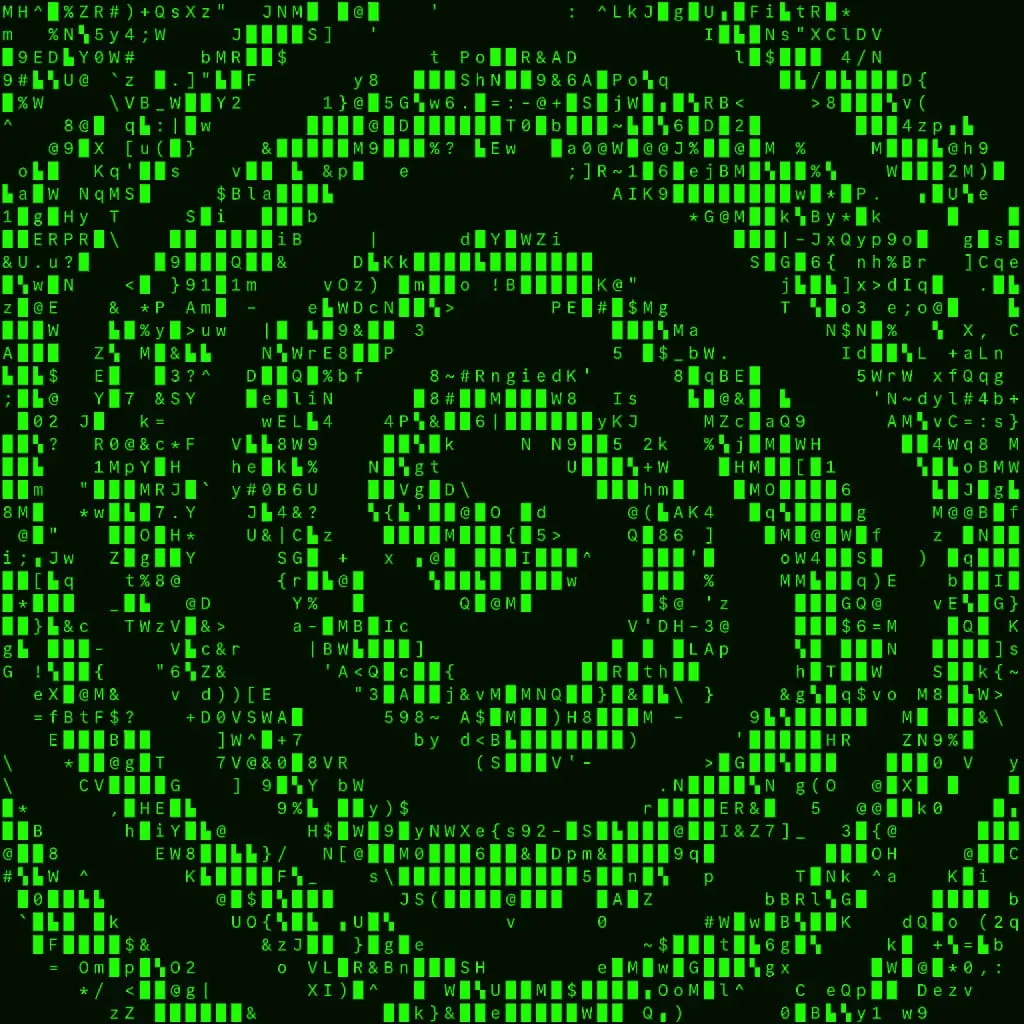
ASCII art. Character-based computer images since the 1960s; terminal and net art.
Typeface · IBM Plex Mono
ASCII look: current digital effect demonstration.Digital effect demonstration; not a historical terminal printout.View source ↗
Prompt
Transform this image into ASCII Art, rebuilding its visible forms entirely from evenly spaced monospaced letters, numbers, and punctuation. Use dense character clusters for shadows and sparse marks for highlights, with black glyphs on an ivory background and clearly readable stepped contours. Keep the original subject and composition.
Create adesign using only spaces, periods, plus signs, and hash symbols.
Background
The visual world of early computer terminals and printers transformed text itself into visual material. ASCII was standardized in 1963; the method of drawing with characters has further, even pre-digital, histories. In today's software, the brightness of an image cell is assigned to acharacter shape. Adigital image editor allows for modifiable character sets, raster density, and color. This slide discusses this principle without claiming asingle inventor of all ASCII art.
Distinction
Unicode blocks and Braille characters extend the approach but are not part of the original ASCII character set. The illustration is amodern conversion.
Aftermath
Image and text are the same visual surface here.
Further examples · 7 images
02Ascii art alphabetThe Latin alphabet is presented where each large letter is composed of smaller, repeated versions of itself. This is a classic example of using text characters to form larger, readable shapes.Numberguy6 · CC BY-SA 4.0 · Wikimedia Commons03Dag Hammarskjöld - ASCII - teleprinter art -1962A portrait of Dag Hammarskjöld is formed by dense rows of characters like 'M' and 'H' on paper. This 1962 teleprinter art shows early mechanical printers generating images through character overstriking and density.Foto: Jonn Leffmann · CC BY 3.0 · Wikimedia Commons04Operation Epik FailThe words 'Operation EPIK FAIL' are written using slashes, underscores, and pipes to create a block-letter effect. It represents the 'FIGlet' style of ASCII art commonly used in digital signatures and banners.AnonymousUnknown author · Public domain · Wikimedia Commons05NVIDIA ASCII logoThe NVIDIA eye logo is depicted using green-tinted characters that vary in density to create shading. The composition uses color-coding and character frequency to replicate a modern corporate brand identity.Wikideas1 · Public domain · Wikimedia Commons06Privacy ASCII ArtThe word 'Privacy' is spelled out using a decorative font composed of '8', 'a', 'b', and 'P' characters. This illustrates 'banner' style art where characters are chosen for their specific shapes to build letters.Paolomarco · CC0 · Wikimedia Commons07ASCII ART ZebraA zebra's patterns are represented by a chaotic arrangement of characters with varying visual weights. The high-contrast nature of the animal is successfully translated through the varying darkness of the selected symbols.My rework of the above file · CC0 · Wikimedia Commons
Question
Why does the same grid look different in two fonts?
Show possible answer +Hide answer −
The characters have different shapes, densities, and proportions. This changes the brightness assignment and the spatial structure.